Edward Tufte: Presenting Data and Information
January 17, 2020
In December, I attended Edward Tufte's course on Presenting Data and Information in San Francisco. Here are my key takeaways from the course.
Hold an open mind, but not an open head.
Edward Tufte
The purpose of data is to make people smarter— so don't dumb it down
When presenting information, chances are the audience has already been filtered by some homogenizing process—your colleagues, people that have made a conscious decision to come to your presentation, etc.
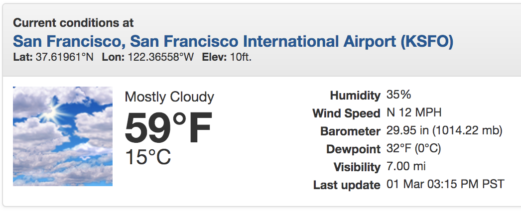
Here is an example of an appropriate amount of data from the National Weather Service.
 |
|---|
| National Weather Service. Source |
Most visitors to the National Weather Service website care about the temperature and conditions (eg. mostly cloudy). This information is accurately and concisely presented via a large "59°F" and image representing mostly cloudy conditions.
However, more data points are available to constituents that require more information—as a pilot, the wind speed, barometric pressure, dewpoint, and visibility are some factors that determine if I'm flying or staying on the ground (these measurements are probably from the SFO Terminal Area Forecast).
Minimize design-figuring-out time, maximize content-reasoning time
Diagrammatic pictures allow more focused, tighter commentary on pictures, compared to text or captions outside the picture frame.
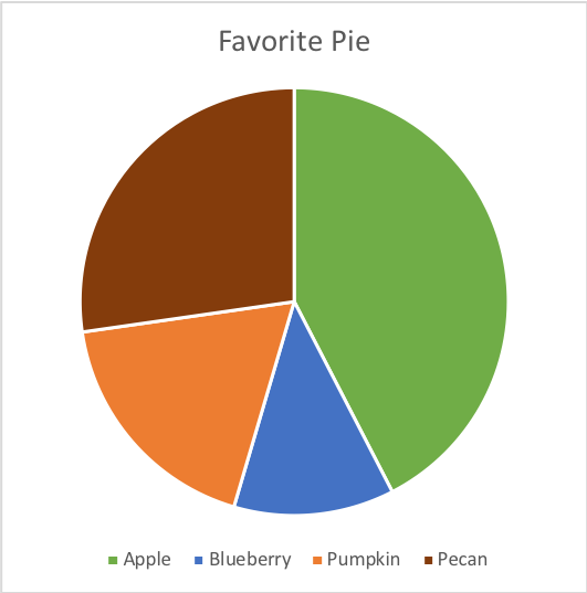
The following pie chart has a high cognitive load, because the user has the impediment of visually encoding the chart data with the pie type.

To further the damage from the pie chart without direct labeling, it may be impossible to read the chart as a colorblind person or when printed or photocopied in grayscale.
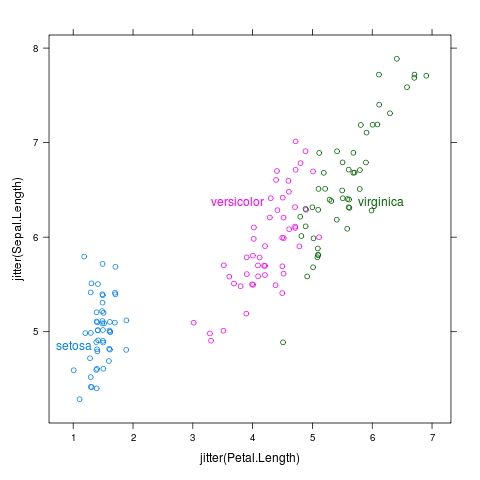
On the other hand, the following scatterplot uses direct labeling to minimize content-reasoning time.
 |
|---|
Direct labeled Iris data, demonstrated from the directlabels R package. Source |
It's better to be approximately right than precisely wrong
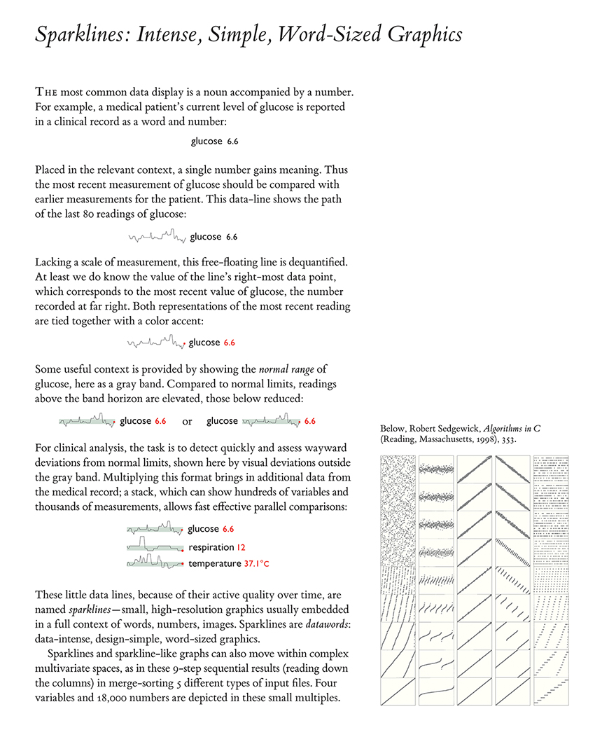
I'll let the following excerpt from Tufte's Beautiful Evidence speak for itself.
 |
|---|
| Edward Tufte. Beautiful Evidence, p.47. Source |
And finally, here's a fun satire on all the no-nos of presenting data and information.